
However, I think I have an average amount of talent that comes from a B.A. And I do occasionally design things for various people and purposes. And I am constantly reminded (aside fromthe times when I do the business cards for friends) of why I could never do this for a living.
I first learned this concept when I was interning as a designer in high school.
Bad design often triumphs over good, and there's nothing you can do about it.
Here's a recent example:
Yesterday I go an email request to do a design for a church program that I don't entirely understand. Vague names were dropped, something about a firm and "could you do another design for us? By this afternoon?"
Here's what they attached in the email, that they were unhappy with-

I emailed them back and said I'd work on it until the baby woke up, which turned out to be about 20 minutes and this is what I sent back to them (I'm not crazy about it, but it wasn't horrible either)-
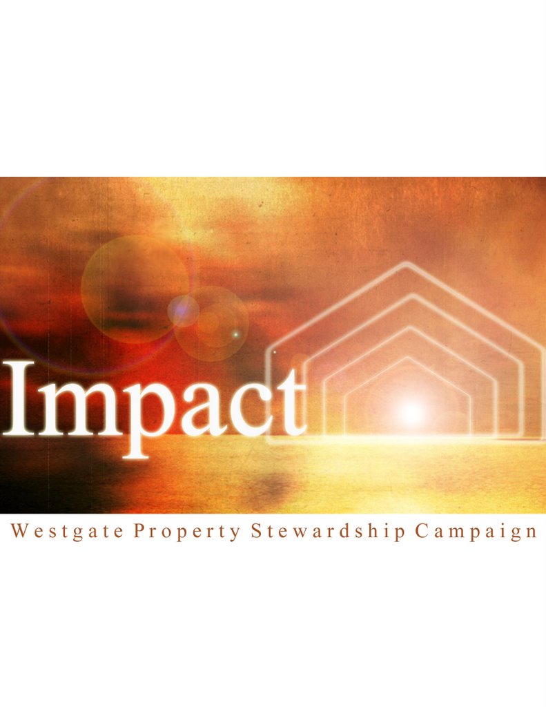
I didn't really understand what the whole thing was about, so I didn't get to emotionally involved with it. I believe the "Impact" title is what they are calling a new wave of asking for funds to demolish our existing church building after the new one is built. And I guess somehow we're going to impact people by doing so? It's hazey.
All I knew is that the first design looked like a default powerpoint background and WordArt you might find in a ill-begotten employee training seminar. It didn't really say "we are the body of Christ here stirving to love our community better."
And which did they go with?
The first one, of course.
He (a man I've never met) said everyone really liked mine but they went the other one for reasons I could request from him if I wanted to. I don't want to know. I'll just get depressed about it.
I just hope all the people that see this marketing tool are hard core left brainers so they don't get creeped out by the corporate-feel.
Oye.

2 comments:
I'm the first to admit I have no creative side...that said, I carefully looked at each and have to say truthfully yours made more of an "impact" on me!!!
It's the lens flare. That's why they didn't choose yours. Kidding!
The first one seems very corporate, very "office-like" to me. Seriously, what's up with the subtle pyramid triangles?
Yours is very country-side, very earthy- very natural (sans lens flare). I like the sturcture in there (possibly resembling a church). It's very light, fresh, and warm.
You know uneducated consumers sometimes don't know what they want and I just think they got confused & scared.
If it was my church, I'd have gone with yours!
Post a Comment